
I’m thinking about changing the left sidebar of the site slightly. Currently the “Categories” list is on the top, and the “Recent Comments” is further down. I’m thinking about switching them. See image below, with my weak graphics effort to show what I mean.
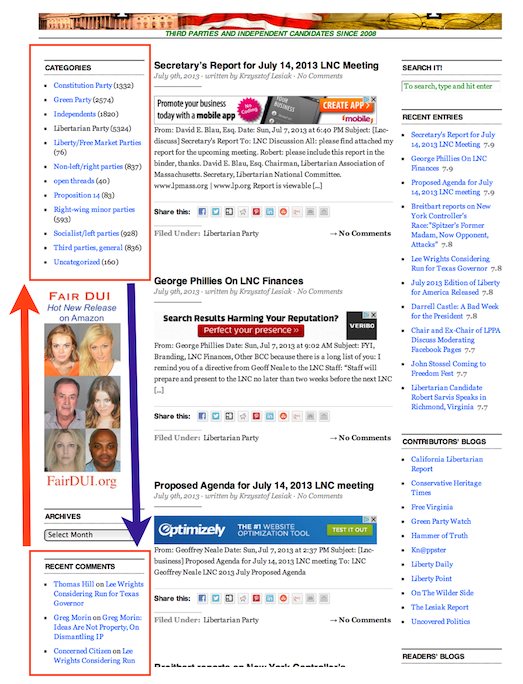
From the site analytics, it looks like the category pages are not the prime destination for users. See this “next page path” from the home page:

Based on these statistics, and my own usage of the site, I think most users are more interested in recent comments (because they’re involved in a conversation) than in categories.
Please comment on this post to let me know what you think of this idea.
Thanks,
Warren
From the site analytics…
Wish I could still see them. It used to be a big part of my IPR experience. Since the changes implemented while I was away, I can no longer see the stats 🙁
I like the suggested change (putting recent comments higher).
I like the proposal, I’d also like to see the expanded list of recent posts on the ride sidebar. I know, that requires access to the coding, and may take a while to get done.
I vote yes; I never use the categories anyway, and the recent comments are very helpful, so they should be higher up on the page.
I like putting comments on top – that’s the sexy part of IPR … the categories, although very important info, is more for research.
i like the idea of using user use statistics to drive design changes.
I like the idea of that change. In fact I had thought about suggesting that the two sections be switched, but just never got around to writing an email about it.
@4 Matt
Good point about the new readers. Yes, we should definitively keep the site the way it is right now.
I think I prefer it the way it is now. However, I’m pretty sure that’s just because I’m used to it this way. When I think about it, it seems like bringing the comments up and categories down makes sense for regular users.
On the other hand though, what is best for someone who comes to the site for the first time? I feel like the listing of categories provides an additional clue as to what this site is all about.
So, all things considered, I guess I lean slightly towards keeping it as it is.
I personally prefer how it is set up right now. That’s just me, though.
It would be wise to set Recent comments and Recent entries at the same level visually. They counter each other and might peak interest with live conversations rather than rehash older ones.
You might also start a ranking strata for stories that get more comments or more hits. Instead of ranking per date entered on the site. It might keep the side bar in play more often if the recent entries offer the reader a chance to get involved with a live story.
Good luck.
Yes. Good idea.